SUKHUMVIT 105
A building for people who do not know it yetอาคารสำหรับคนที่ยังไม่รู้จักมัน
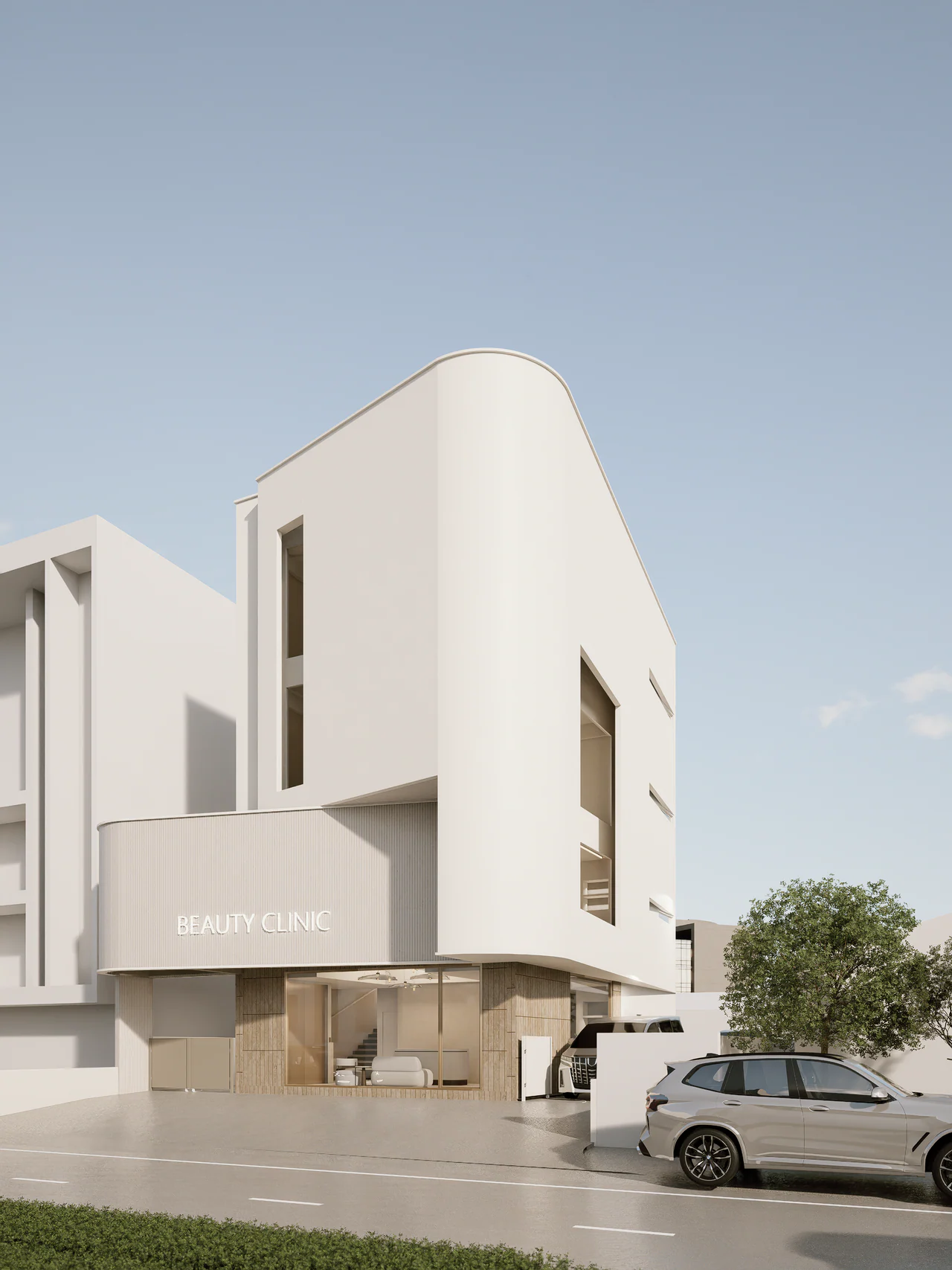
Before SUKHUMVIT 105 became a composition of pale walls, recessed openings and a rounded upper corner, the plot contained a house. The change of use altered more than the programme. A house is usually understood by people who already know where to enter, where to wait and what lies beyond each door. A commercial building has to explain more of itself to people arriving for the first time.
ก่อนที่ SUKHUMVIT 105 จะกลายเป็นภาพของผนังสีอ่อน ช่องเปิดที่ถอยลึก และมุมอาคารโค้ง ที่ดินผืนนี้เคยมีบ้านอยู่ การเปลี่ยนการใช้งานจึงไม่ได้เปลี่ยนแค่รายการห้อง แต่เปลี่ยนวิธีที่สถานที่ต้องสื่อสารกับคน บ้านมักถูกใช้งานโดยคนที่รู้แล้วว่าควรเข้าทางไหน รอตรงไหน และหลังประตูแต่ละบานมีอะไร แต่อาคารพาณิชย์ต้องอธิบายตัวเองให้มากขึ้นกับคนที่เพิ่งมาถึงเป็นครั้งแรก
The early studies asked how a clinic could become more contained than a conventional commercial interior without turning away from the city completely. That question was tested through massing, degrees of openness, material direction and several facade alternatives. By DD4, the exterior study had expanded to seven facade options. The phrase used internally—Crafted Clarity & Filtered Warmth—was not a finished answer so much as a way to test whether the architecture could be clear without becoming severe, and warm without relying on decoration alone.
การศึกษาช่วงแรกตั้งคำถามว่าพื้นที่คลินิกจะมีความเป็นส่วนตัวและมีระยะจากความวุ่นวายของเมืองได้อย่างไร โดยไม่จำเป็นต้องปิดตัวจากภายนอกทั้งหมด คำถามนี้ถูกทดลองผ่านมวลอาคาร ระดับความเปิดของพื้นที่ ทิศทางวัสดุ และรูปด้านหลายทางเลือก จนใน DD4 มีการพัฒนา Facade ถึง 7 Options คำว่า Crafted Clarity & Filtered Warmth ที่ใช้ภายในกระบวนการจึงไม่ใช่คำตอบสำเร็จรูป แต่เป็นกรอบสำหรับตรวจว่าอาคารจะชัดเจนโดยไม่แข็งเกินไป และมีความอบอุ่นโดยไม่ต้องพึ่งการตกแต่งจำนวนมากได้หรือไม่
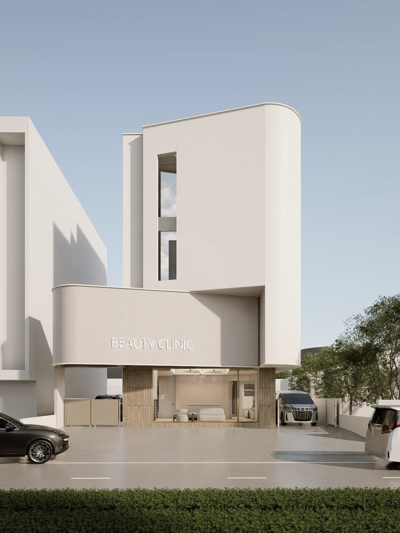
The current visualisations hold those decisions together in a restrained facade. The upper volume is comparatively solid, interrupted by deep vertical openings and softened by the turn of the corner. At street level, the building becomes more transparent. The clinic name belongs to a horizontal band above the glazing. Behind it, reception and waiting begin to appear. The facade does not disclose every room. It gives just enough information to mark where public activity begins.
ภาพการออกแบบปัจจุบันรวบการตัดสินใจเหล่านั้นไว้ในรูปด้านที่ค่อนข้างยับยั้ง มวลส่วนบนทึบกว่า มีช่องเปิดแนวตั้งที่ถอยลึกและมุมอาคารที่เลี้ยวอย่างต่อเนื่อง ขณะที่ระดับถนนเปิดมากขึ้น ชื่อคลินิกอยู่บนแถบแนวนอนเหนือกระจก และด้านหลังเริ่มมองเห็น Reception กับพื้นที่นั่งรอ รูปด้านจึงไม่ได้เปิดเผยทุกห้อง แต่ให้ข้อมูลมากพอที่จะบอกว่ากิจกรรมสาธารณะของอาคารเริ่มตรงไหน
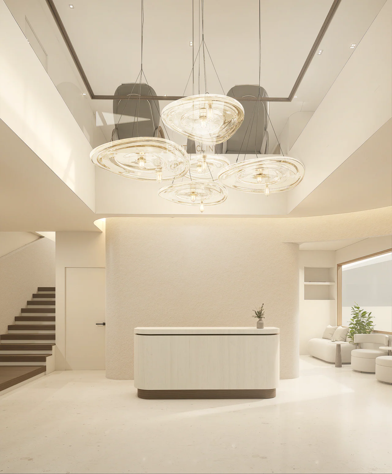
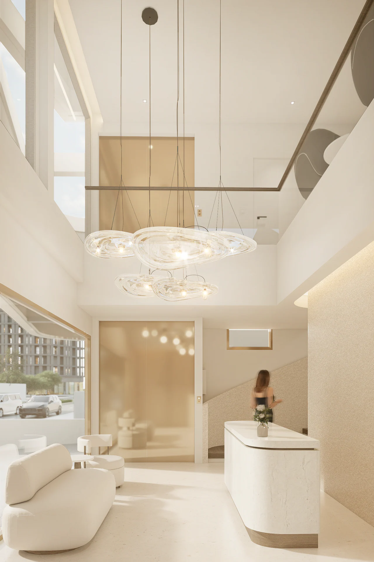
The same idea had to survive after the front door. During design development, the lobby was repeatedly tested the opening between zones was widened, seating was reconsidered, the relationship to the stair was adjusted and the double-height condition was tested rather than treated as an automatic feature. In the current interior views, a curved reception counter anchors the lower level while the void, stair and upper balustrade remain visible in the same field.
แนวคิดเดียวกันต้องทำงานต่อหลังผ่านประตูเข้าไป ในช่วงพัฒนาแบบ Lobby ถูกทดลองหลายครั้ง ทั้งการขยายช่องเชื่อมระหว่างพื้นที่ การปรับจำนวนและรูปแบบที่นั่ง การทบทวนความสัมพันธ์กับบันได และการทดสอบว่าจะใช้ Double Height หรือไม่ แทนที่จะถือว่าโถงสูงเป็นคำตอบโดยอัตโนมัติ ในภาพปัจจุบัน เคาน์เตอร์ขอบโค้งทำหน้าที่เป็นจุดอ้างอิงของชั้นล่าง ขณะที่ช่องว่าง บันได และราวชั้นบนยังอยู่ในมุมมองเดียวกัน
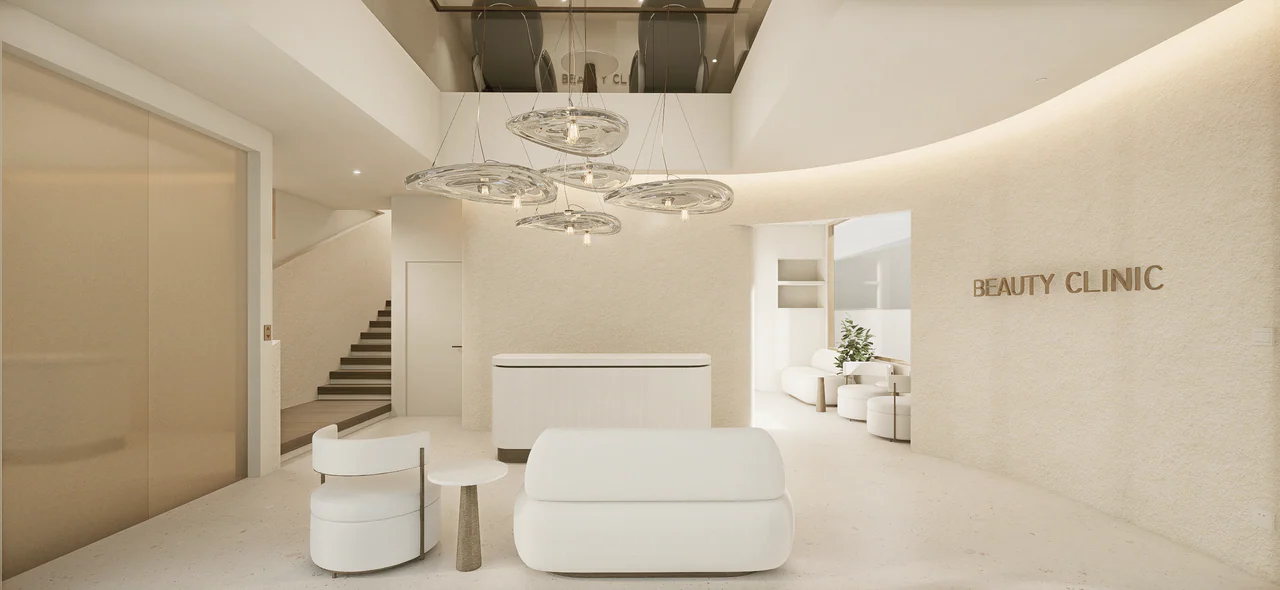
The curve is one of the elements that changes scale across the project. Outside, it turns the mass of the building. Inside, it becomes the edge of a counter, a wall and pieces of furniture. It is not repeated because repetition is a virtue. It is adjusted because each scale asks the geometry to do a different job.
เส้นโค้งเป็นหนึ่งในองค์ประกอบที่เปลี่ยน Scale ไปตลอดโครงการ ภายนอกมันใช้เลี้ยวมวลอาคาร ภายในมันกลายเป็นขอบเคาน์เตอร์ แนวผนัง และรูปทรงของเฟอร์นิเจอร์ ไม่ได้ถูกทำซ้ำเพราะความเหมือนเป็นคุณค่าในตัวเอง แต่ถูกปรับเพราะแต่ละ Scale ต้องการให้รูปทรงทำหน้าที่ต่างกัน
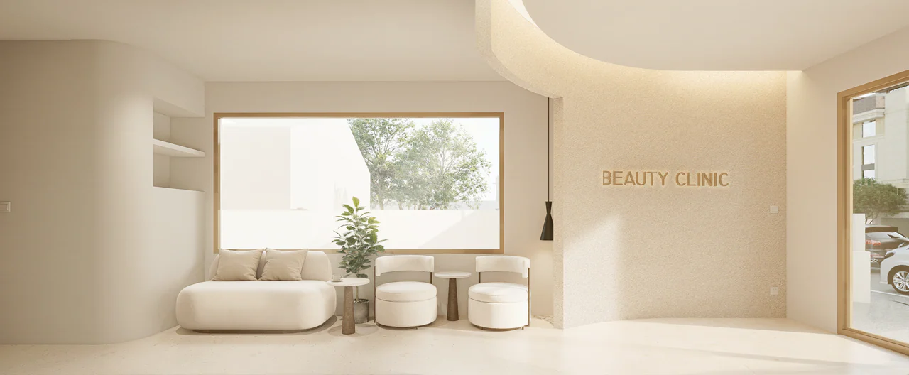
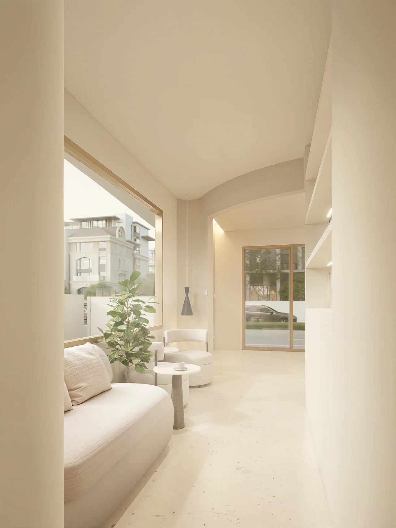
Further inside, continuity becomes less about visibility and more about boundaries. Consultation and treatment rooms retain related tones and softened geometry, but their furniture, enclosure and working surfaces change according to use. The project does not ask every room to behave like the lobby. A common language remains useful only when it can accommodate different degrees of publicness.
เมื่อเดินลึกเข้าไป ความต่อเนื่องไม่ได้อยู่ที่การมองเห็นกันมากเท่าเดิม แต่ย้ายไปอยู่ที่การจัดขอบเขต ห้องปรึกษาและห้องทรีตเมนต์ยังใช้โทนและรูปทรงที่สัมพันธ์กัน แต่เฟอร์นิเจอร์ ระดับการปิดล้อม และพื้นผิวใช้งานเปลี่ยนไปตามหน้าที่ โครงการไม่ได้บังคับให้ทุกห้องทำตัวเหมือน Lobby เพราะภาษาร่วมจะมีประโยชน์ก็ต่อเมื่อมันรองรับระดับความเป็นสาธารณะที่ต่างกันได้
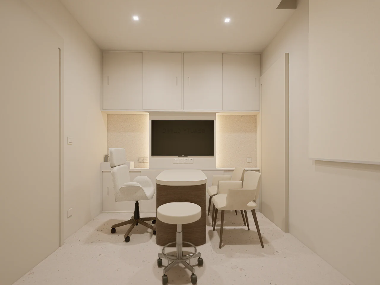
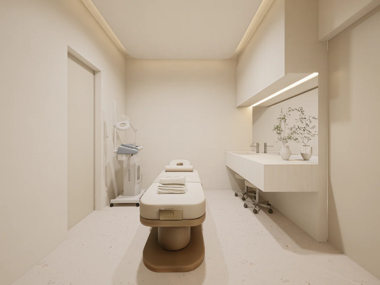
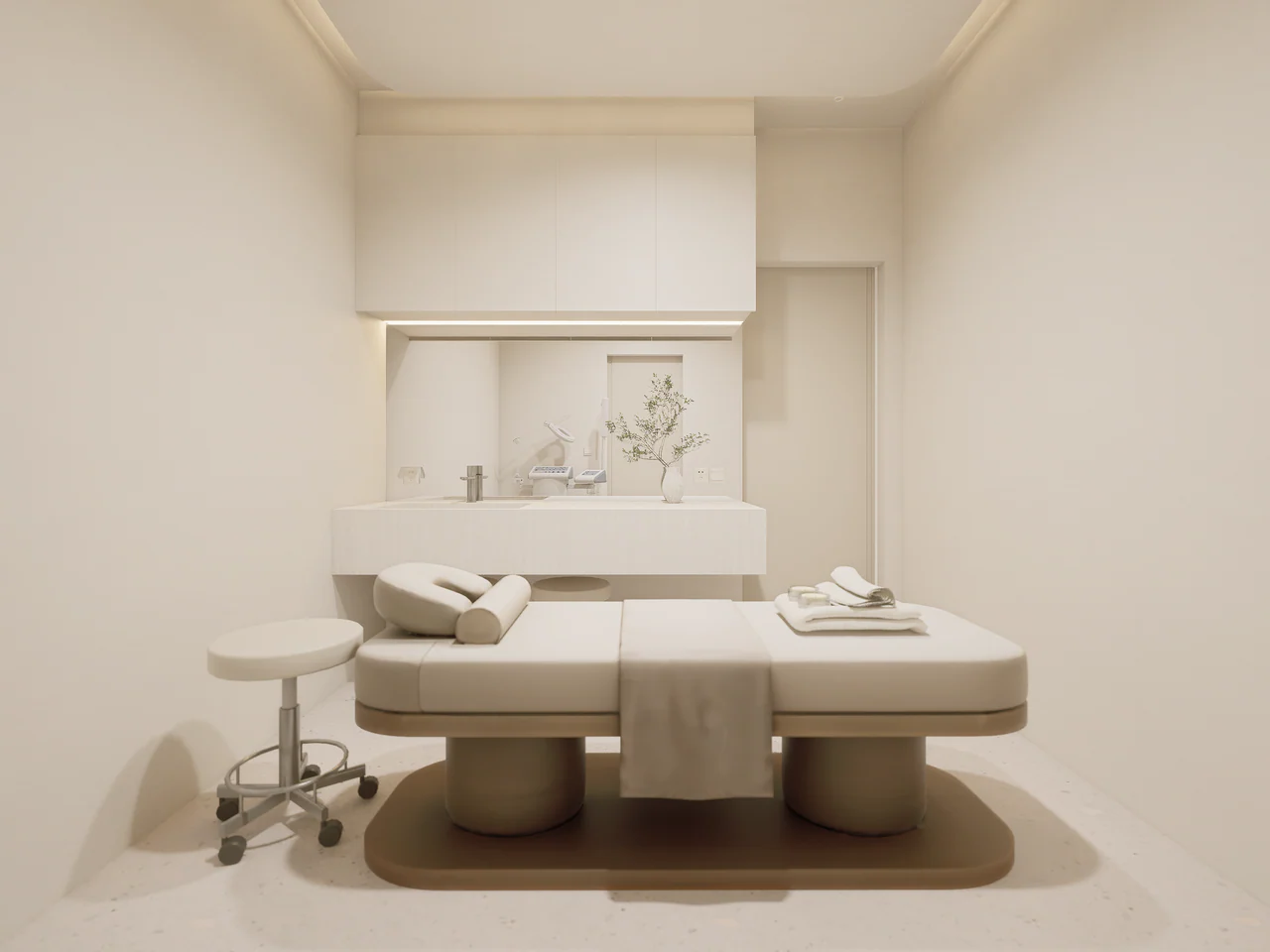
SUKHUMVIT 105 is therefore less a story about making a clinic “soft” than about calibrating clarity—how much the building should reveal from the street, what a visitor should understand on arrival, and how an architectural idea can remain recognisable as it moves from the scale of a facade to the scale of a counter, a chair and a room.
SUKHUMVIT 105 จึงไม่ใช่เรื่องของการทำให้คลินิก “ดูนุ่ม” เป็นหลัก แต่เป็นการปรับระดับของความชัดเจน ว่าจากถนนควรเปิดเผยอะไร เมื่อเข้ามาถึงควรเข้าใจอะไร และแนวคิดทางสถาปัตยกรรมจะยังถูกจดจำได้อย่างไร เมื่อมันค่อยๆ ลดขนาดจาก Facade ลงมาถึงเคาน์เตอร์ เก้าอี้ และห้องหนึ่งห้อง
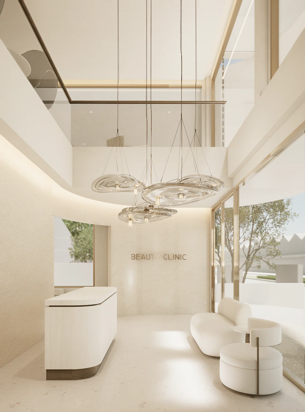
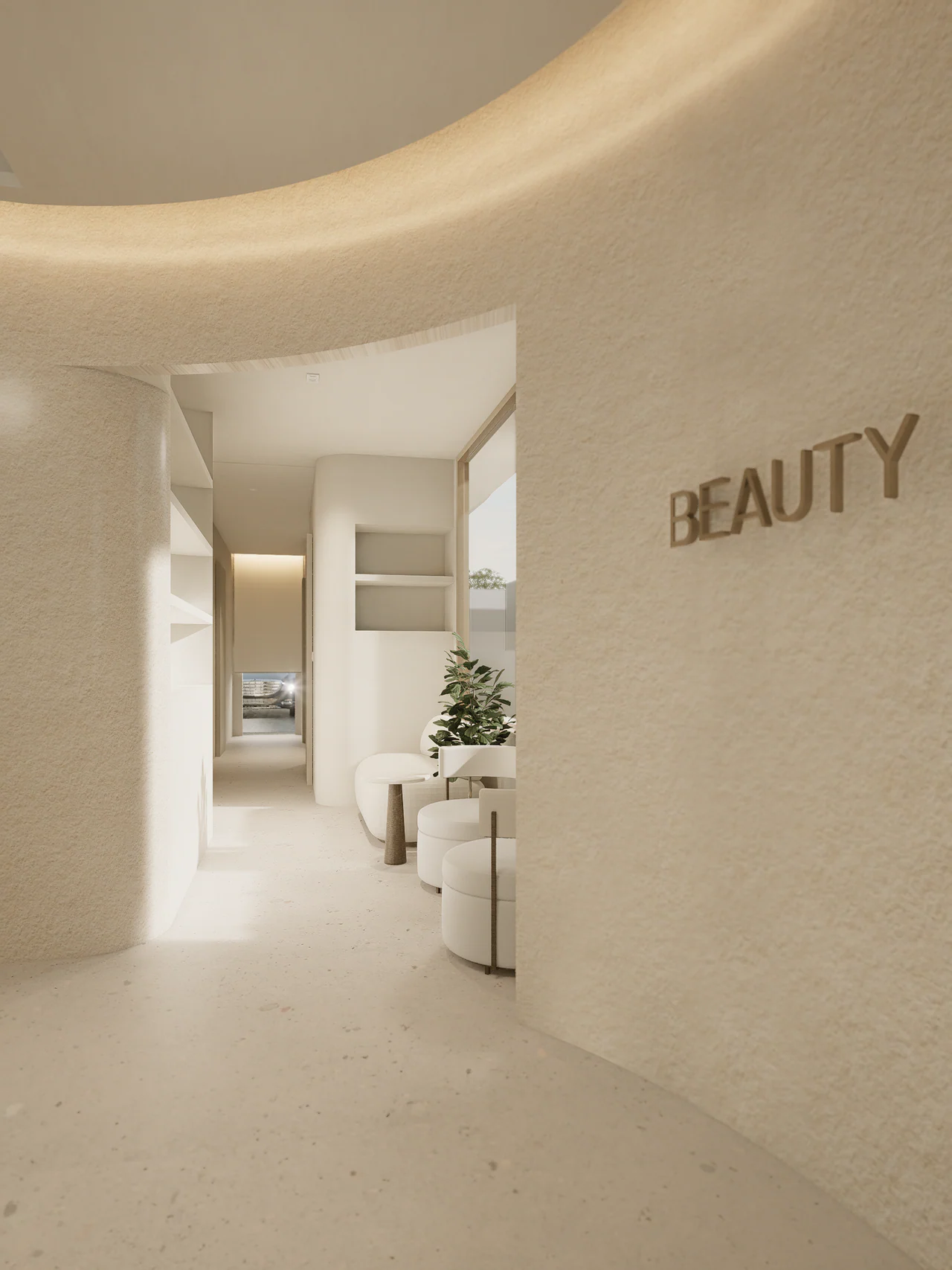
Design visualisations. The images describe design intent and are not photographs of completed construction.
ภาพทั้งหมดเป็น Design Visualisations เพื่ออธิบายแนวคิดและทิศทางการออกแบบ ไม่ใช่ภาพถ่ายอาคารที่ก่อสร้างแล้วเสร็จ
PROJECT CREDIT
Design Direction NATTHA / Natthapon Khemmueang
Design Development & Project Delivery Piaoform Studio