Beige is a colour. Warmth is a relationship.Beige คือสี ส่วน Warmth คือความสัมพันธ์
There is nothing wrong with beige.
สี Beige ไม่ได้มีปัญหาอะไร
The problem begins when one colour is asked to explain the whole atmosphere of a room.
ปัญหาเริ่มขึ้นเมื่อเราให้สีเดียวรับผิดชอบการอธิบายบรรยากาศทั้งห้อง
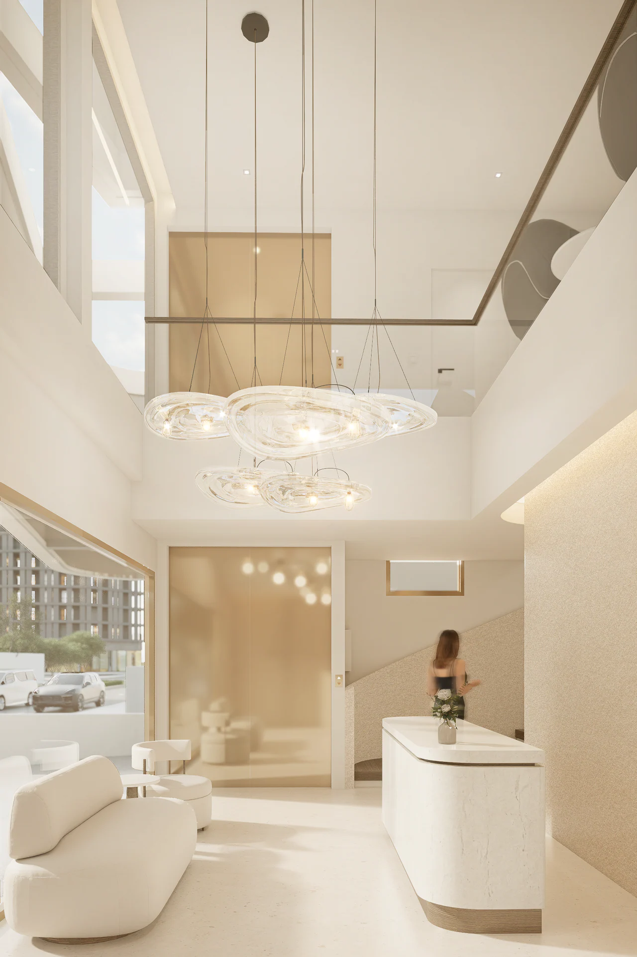
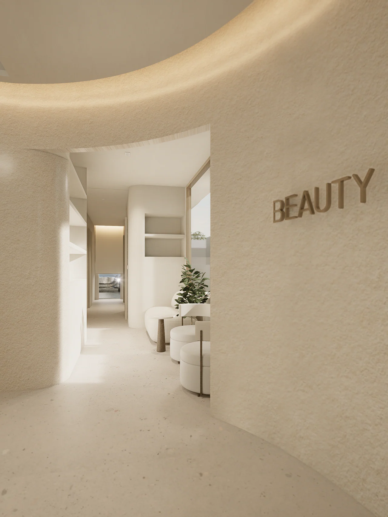
In SUKHUMVIT 105, the pale palette is obvious in the images, but what interests me more is what happens around it the radius of an edge, the depth of a recess, a textured wall next to a smoother surface, the gap between furniture, light caught on a curve, storage becoming part of the room instead of an added cabinet.
ในภาพ SUKHUMVIT 105 โทนสีอ่อนเห็นได้ชัด แต่สิ่งที่ผมสนใจกว่าคือสิ่งที่เกิดขึ้นรอบๆ สี—รัศมีของขอบ ความลึกของช่อง ผิวที่มี Texture วางข้างผิวที่เรียบกว่า ระยะระหว่างเฟอร์นิเจอร์ แสงที่เกาะอยู่บนเส้นโค้ง หรือการทำให้ที่เก็บของเป็นส่วนหนึ่งของห้องแทนที่จะเป็นตู้ที่เอามาวางทีหลัง
Those relationships are doing work that a colour name cannot do.
ความสัมพันธ์เหล่านี้กำลังทำงานที่ชื่อสีทำแทนไม่ได้
When I use the word “warmth” in design, I would rather be able to point to what creates it than expect the adjective to finish the explanation for me.
เวลาผมใช้คำว่า “Warmth” ในงานออกแบบ ผมอยากชี้ให้ได้ว่ามันเกิดจากอะไร มากกว่าปล่อยให้คำคุณศัพท์จบคำอธิบายแทนเรา
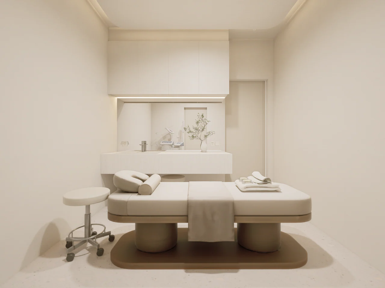
Images are design visualisations.
ภาพประกอบเป็นภาพออกแบบ
PROJECT CREDIT
Project SUKHUMVIT 105
Design Direction NATTHA / Natthapon Khemmueang
Design Development & Project Delivery Piaoform Studio